
TOTE Widget
TOTE
OVERVIEW
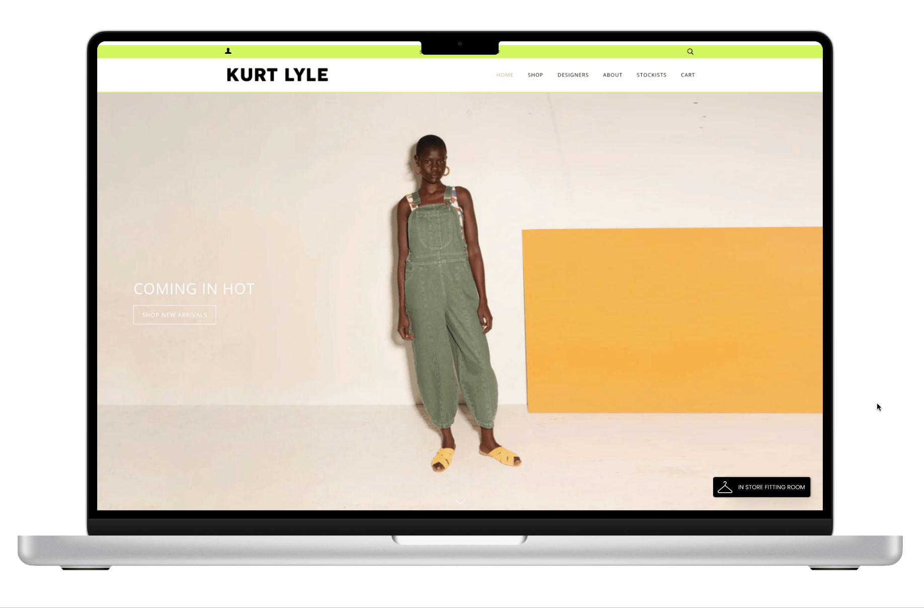
TOTE is a B2B e-commerce widget that allows shoppers to book an in store fitting room while online shopping. The widget is currently in the Shopify App Store.
I worked with a team of 3 other designers to redesign the TOTE widget to enhance the online to in store shopping experience.
ROLE
UX Designer, Researcher, Writer
3 weeks
Responsible for research, analysis, design, testing, and delivery. User Research, Visual design, Interaction, Prototyping & Testing,

Problem
TOTE was created out of a need to shop more efficiently. However, no user research was done in order to determine what shoppers would need and how they would use the widget. The widget was difficult and had an outdated look.
TOTE came to us to redesign their widget to be more user focused and be presented to investors.
How might we redesign TOTE to appeal to users so they can easily and quickly book fitting rooms for their favorite items?
Scope and constraints
A 3 week time frame required everyone on the team to work collaboratively and on time.
The TOTE widget is marketed to boutique shops, but we focused on the end user and their journey. This would directly impact each shop and ensure that the widget would be beneficial.
Previous research and data was limited. Most of our research would need to be done via zoom to move quickly.
SOLUTION
A complete user centric redesign of the TOTE widget to give shoppers an omnichannel experience.

Discover
RESEARCH
We started with user interviews and testing of current widget, heuristic evaluation, and a competitive/comparative analysis to better understand the market and pain points. Conducting research would be a main focus due to the lack of data and previous research.
Interviews
Initial design audit
In the interviews we found a few similarities with the interviewees and how they like to shop and what their shopping personalities are. Most people were a 50/50 with shopping in store and online.
People like to shop online for the variety of products, but would still like to try things on before purchasing.
Most shoppers prefer to not interact with store employees unless they need help with specific issues/products.
Determine flows and pain points.
Tasks:
Book an appointment
Add item to fitting room
Change appointment


Participants for the interviews were pre-screened to match the target demographic of women between the ages of 25-40. All participants were recruited from our team’s network. Interviews were conducted via Zoom.
Heuristic Evaluation
After interviews, we still needed to find out how user friendly the current widget was. We found areas that we could improve as well as areas TOTE already did well.
Key Insights
Most interactions followed expected standards
Currently uses familiar and casual language
Clean and concise look
Lacks interaction feedback
Lack of visual consistency with buttons, text fields, colors
Visibility issues with text fields
Missing error messages

Users skipped the educations screens, didn’t want to book appointments, and were confused…


TOTE’s original design:
Competitive and Comparative Analysis
Competitive analysis was done solely based on making appointments because there are no direct competitors to TOTE, but there are other applications that book appointments.

Competitors offered
Zoom/Facetime integration
Visually clean look
Easy process
Multiple ways to reach shop and customer service
Comparative analysis was done with other omnichannel stores to find what features we needed and how users expect to interact with stores.
Ways to use in store and online with mobile app
Logging in could frustrate users
Difficult to find with little education on how to use

Define
Journey Mapping

Looking at our usability testing, users started off their journey curious but eventually grew frustrated. We found specific points where users become confused and eventually frustrated and found areas we could improve.
Areas to improve:
Error prevention and more contrast to buttons
Interaction feedback so users know when something is added to their fitting room and where it is
Add a reschedule option
Education screens
Design
Wireframes

develop
Usability Testing round 2
Takeaways
Easy to cancel and reschedule
Would use the widget
Enjoy the education screens
Change order of confirmation windows
Wording on some screens seems awkward
Adjust contrast when deleting item
Shorten the edit appointment flow
Appointment bookings
After testing our designs with users, we found that the widget was easier to use, but still needed some adjustments.
We also decided to make a major change and remove the ability to make personal appointments. It still didn’t make sense to users. We decided the focus needed to be booking fitting rooms.

Iterations

Confirmation page
Appointment information
Formatting
Visibility issues
Added privacy info
Made booking process faster
One screen example of changes
NEW screens and prototype


Thoughts and takeaways
Focus on the user. Don’t be afraid to speak up for what they want. We proposed a pretty radical shift when we mentioned losing the ability to book personal appointments, but it is what our users wanted.
Take initiative. We received feedback from the client that they appreciated us getting whatever info we could and we kept moving on. We would ask for what we needed instead of someone offering it to us. This is really important especially when working with a startup or small company.
Build an MVP. We had big goals and aspirations, but not everything can be implemented right away.
I love being part of a team.